Improving Size Selection in Fashion E-commerce
A UX exploration focused on simplifying size selection and improving the product decision flow in online fashion stores.
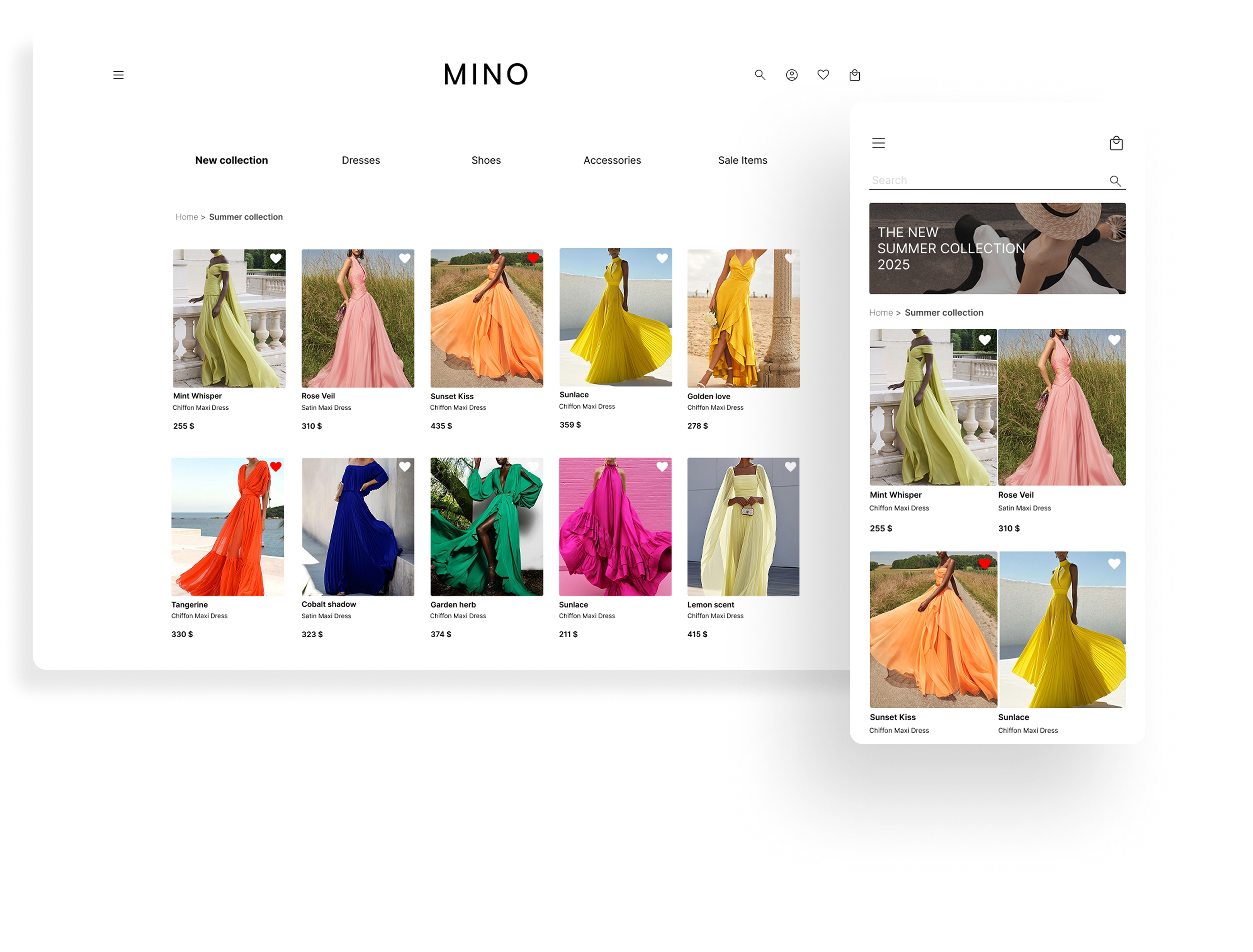
This project explores improvements to a typical clothing e-commerce flow, from browsing products to selecting a size and completing checkout. The main focus was reducing friction during size selection and improving how product information is presented. The goal was to help users make faster purchase decisions without interrupting the shopping flow.
Role: UX & UI Designer (solo)
Tools: Figma
Deliverables: Flows, UI screens, interactions, responsive design.
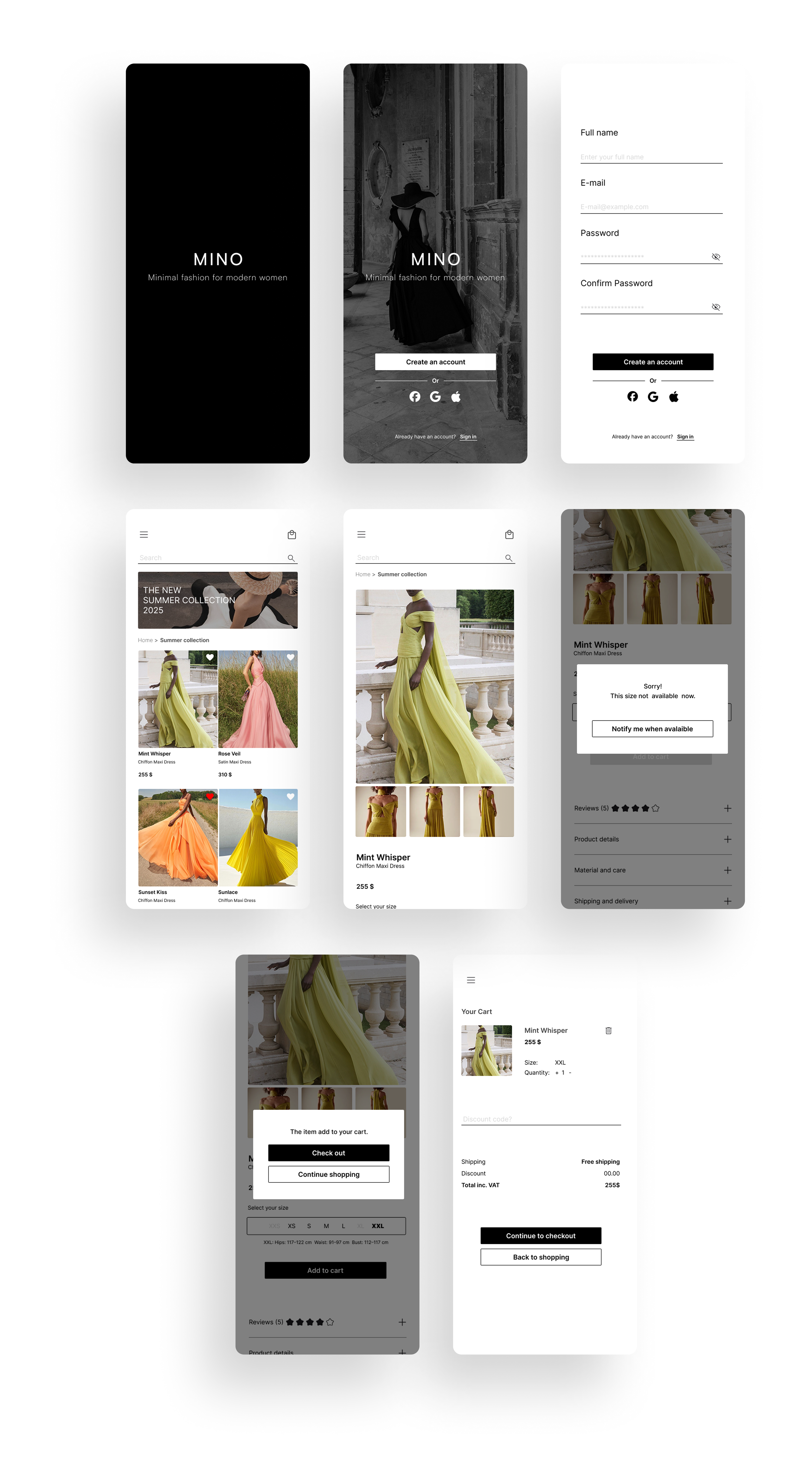
Target users: This concept focuses on everyday online shoppers who want to quickly understand whether a garment might fit them before committing to a purchase. Many users browse multiple products in a short time, so providing key information such as measurements, fabric details, and garment length early in the browsing process helps reduce uncertainty and supports faster decision-making. Problem: IIn many online clothing stores, size selection can be confusing. Users usually need to open a separate size chart and scan through a dense table of measurements to understand which size might fit them. This interrupts the shopping flow and makes it harder to quickly compare sizes while browsing a product. Solution: I redesigned the size selection interaction to make the brand’s size chart easier to access during the purchase flow. When users select a size, key measurements from the brand’s size guide (such as bust, waist, and hips) appear directly below the size options. This allows users to quickly reference the measurements without opening a separate chart or leaving the product page. The product layout was also simplified to make important information easier to scan and support a smoother purchase experience across desktop and mobile. Design decision: The goal was to reduce friction during the size-selection step. Instead of hiding the brand’s size guide behind a separate link or modal, key measurements are surfaced directly within the interface. This keeps users in the product page context and reduces cognitive load when comparing sizes. Surfacing Key Product Information: In many fashion e-commerce stores, users need to open each product page to see basic information such as the material or garment length. To reduce unnecessary clicks, I added key product details directly below the product name in both the product listing and the individual product page. This allows users to quickly understand important characteristics of the garment before opening the full product view. By surfacing this information earlier in the browsing stage, users can scan products more efficiently and make faster decisions.
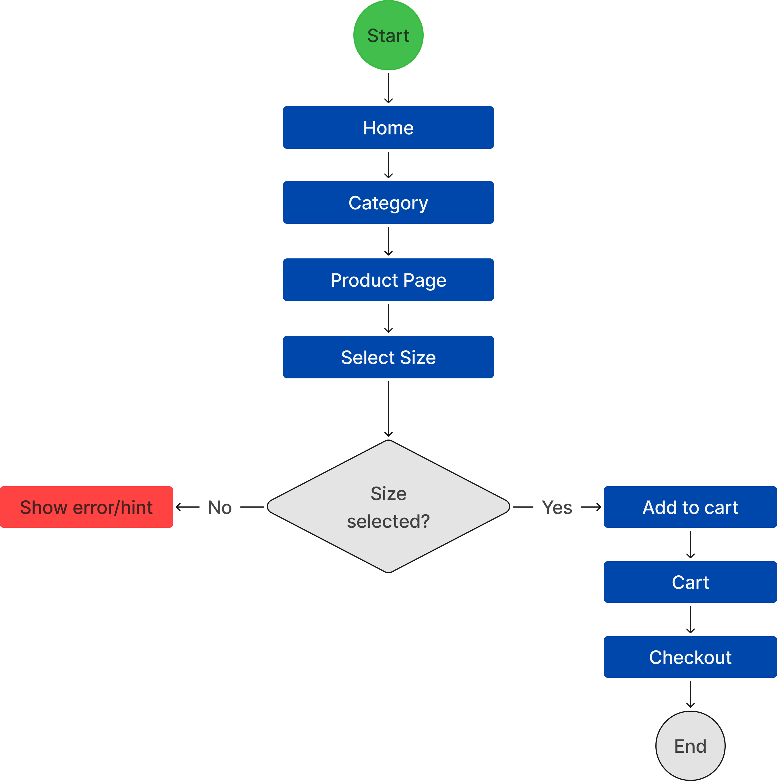
User flow showing the path from browsing products to completing the checkout process.